We made user flows and
wireframes.
With the initial user flows I used our Audi Design Library on Figma to start creating wireframes.
This initial phase of exploration lasted a few months of iterating before
we landed on a solid design that everyone on the team approved.


We made user flows and
wireframes.
With the initial user flows I used our Audi Design Library on Figma to
start creating wireframes.
This initial phase of exploration lasted a few months of iterating before
we landed on a solid design that everyone on the team approved.
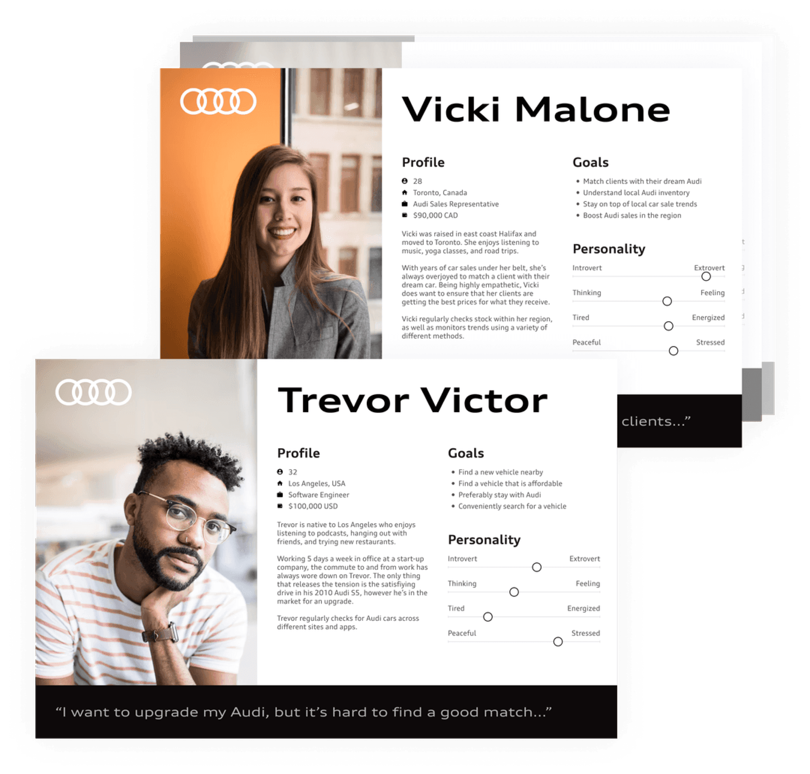

With constant research and testing done as this project went
along we were able to understand our users, empathize with
them, and design for them.
Investigation was a crucial initial move.


Our team was able to conceptualize, and execute a brand new
experience to conveniently and smoothly purchase an Audi
vehicle online in the USA and Canada.
When we began
clients had to go into a
dealership to
purchase an Audi.


When we began
clients had to go into a
dealership to
purchase an Audi.

Our team was able to conceptualize, and execute a brand new
experience to conveniently and smoothly purchase an Audi
vehicle online in the USA and Canada.

Timeline
18 Months

Client
Audi North America
Role
Lead UI Designer
Audi E-Commerce
Purchase Experience
Investigation was a crucial initial move.
With constant research and testing done as this project went
along we were able to understand our users, empathize with
them, and design for them.
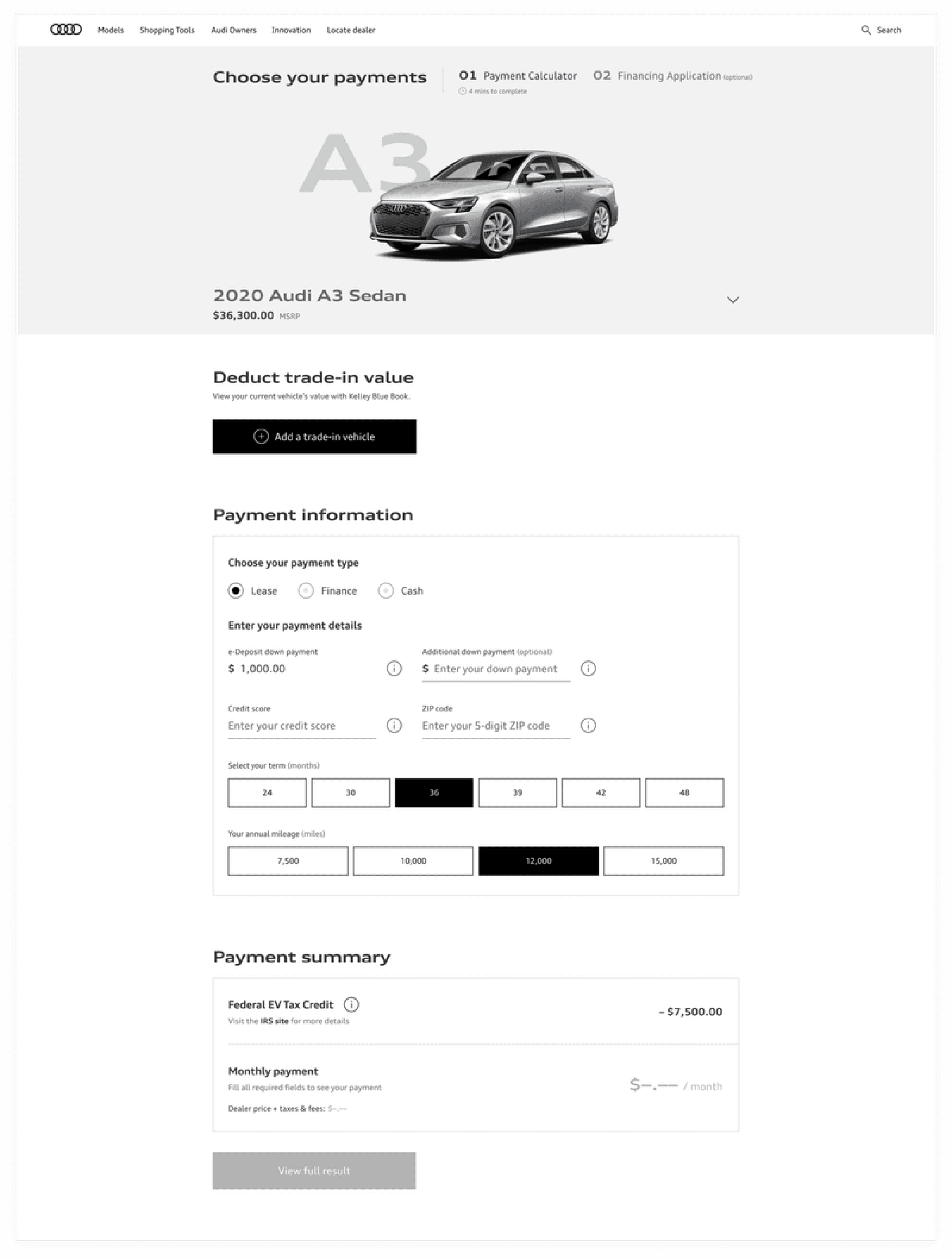

We made user flows and
wireframes.
With the initial user flows I used our Audi Design Library on Figma to
start creating wireframes.
This initial phase of exploration lasted a few months of iterating before
we landed on a solid design that everyone on the team approved.


It was incrementally allocated the UI.
Using a freshly built Figma component library (which I helped
bring to life), we were able to design an application process that
prioritized speed, usability, and user needs in general.
Motion was also explored and designed for, however to meet
deadlines we agreed it would be implemented at a later time.
One of the biggest challenges during this time was constant
changes, meeting legal requirements, and ensuring the UI felt
premium yet easy to use.

While working on the project, I played a key role in developing a fresh Figma component library, which became the foundation for a highly efficient design system. This library helped streamline our work and ensured that we could design an application process that prioritized speed, usability, and overall user satisfaction. By leveraging reusable components, we not only improved design consistency but also significantly reduced the time required to iterate and test different design solutions.
Crafting for Influence: Constructing a Swift,
User-friendly, and Superior
App Interface
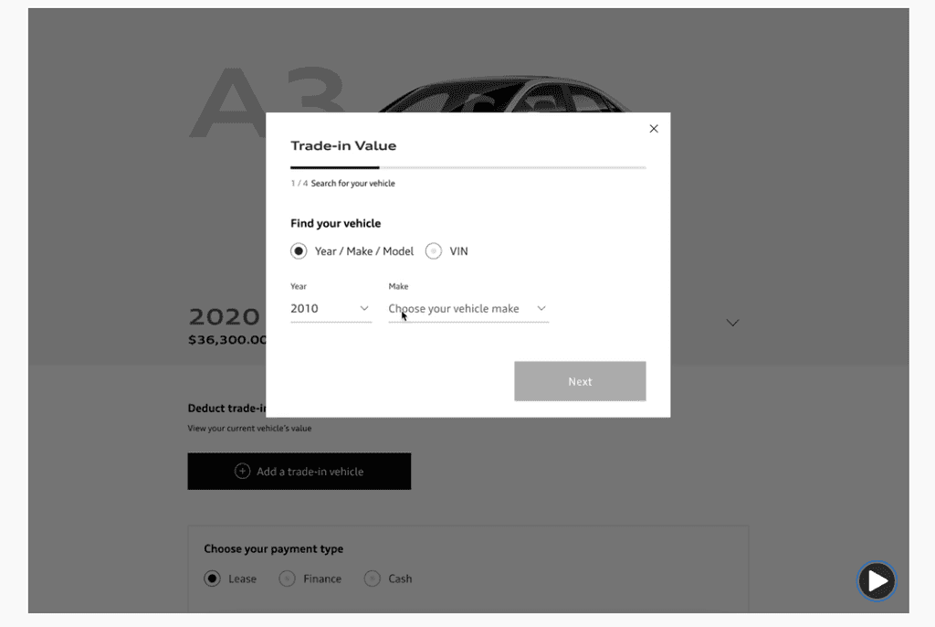
Additionally, we explored motion design to enhance the user experience with smoother transitions and interactions. However, to meet the tight deadlines, we agreed to defer the implementation of motion for future iterations, allowing us to stay focused on delivering a solid, functional product first.
One of the most significant challenges we faced during the project was managing constant changes. These changes were often driven by shifting business needs and ensuring that our designs complied with legal requirements. Despite these constraints, we were able to maintain a delicate balance—creating a UI that not only met legal standards but also retained a premium, polished feel while remaining intuitive and easy for users to navigate.

Contact me
I'm consistently eager to converse. I pledge to reply,
and I'm perpetually willing to address inquiries about design!
Audi E-Commerce
Purchase Experience